Below is an infographic highlighting and detailing the round of 16 contenders in this season’s Champions League. It was created and designed by the folks at Guarantee Tickets. Like O-Posts on Facebook You can also follow O-Posts on Twitter @OPosts
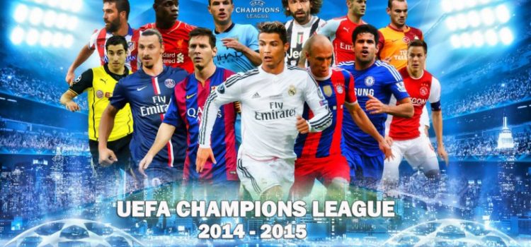

Below is an infographic highlighting and detailing the round of 16 contenders in this season’s Champions League. It was created and designed by the folks at Guarantee Tickets. Like O-Posts on Facebook You can also follow O-Posts on Twitter @OPosts
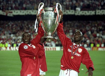
Below is an original Manchester United football trophy timeline infographic created by Aford Awards, a UK manufacturer of football trophies. Like O-Posts on Facebook You can also follow O-Posts on Twitter @OPosts

Below is an infographic highlighting Liverpool’s success and achievements over the years. It was designed by Reflect Digital on behalf of Aford Awards. Like O-Posts on Facebook You can follow O-Posts on Twitter @OPosts

Below is an infographic highlighting Tottenham’s club history and successes since its establishment provided and designed by Reflect Digital on behalf of Aford Awards Football Trophies in conjunction with the official history team at Tottenham Hotspurs. Like O-Posts on Facebook You can also follow O-Posts on Twitter @OPosts
Below here, is a fascinating infographic dating and recalling the successes Chelsea have accomplished throughout the years since their establishment in 1905. Designed by @ReflectDigital on behalf of Aford Awards Football Trophies. Please like O-Posts on Facebook You can follow O-Posts on Twitter @OPosts

Jose Mourinho is up there among the very biggest names in football management. Think about some of the top bosses in the game today – Guardiola, Ancelotti, Ferguson until recently, and Mourinho’s name always pops up alongside them. It’s no wonder why either, he’s led two different clubs to the Champions League title and won
The argument over how much footballers are paid in the modern era has been going on for years now and shows no sign of stopping. Some of the world’s biggest names are now playing with wage packets that let them take home more in a week than many of us will make in our lifetimes,
At PowerTable, we are always looking for new and innovative ways to present football data to fans of the beautiful game. We have therefore come up with our La Liga infographic which is a visual way of showing random data, stats and facts to do with the Spanish football season so far. For instance, how many
At PowerTable, we are always looking for new and innovative ways to present football data to fans of the beautiful game. We have therefore come up with our Serie A infographic which is a visual way of showing random data, stats and facts to do with the Italian football season so far. For instance, how many
At PowerTable, we are always looking for new and innovative ways to present football data to fans of the beautiful game. We have therefore come up with our English Premier League infographic which is a visual way of showing random data, stats and facts to do with the English football season so far. For instance, how
At PowerTable, we are always looking for new and innovative ways to present football data to fans of the beautiful game. We have therefore come up with our Bundesliga infographic which is a visual way of showing random data, stats and facts to do with the German football season so far. For instance, how many